New Graduate, open to work
Project | 01
Diabetics Prediction Analysis

Business Question
How to best predict Type 2 Diabetes using Logistic Regression
Dataset
Data has been retreived from Kaggle(https://www.kaggle.com/tigganeha4/diabetes-dataset-2019) This dataset consists of 952 rows including "Diabetic", response variable, and 17 columns of features.

Data Processing
Creating a simple loop helped us navigate NA values and 47 of them were removed out. As we have 14 categorical variables, label encoding was performed using "recode()" function in dplyr package in a simple and intuitive manner.
Exploratory Data Analysis
As can be seen in Figure1, numerical variables such as BMI, Sleep, SoundSleep, and Pregancies are plotted by Diabetic as probability density functions. Only Pregancies are skewed and other variables are well-distributed as close to normal distribution.

Figure2 shows side-by-side barplots for every categorical variable against Diabetic. Considering we have about 70% of factor "no" and 30% of factor "yes" for Diabetic in total, we can grasp a general idea of data from these plots.

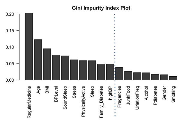
Random Forest
Even though Random Forest is more complicated model compared to logistic regression, this time we use it as feature selection method before we perform logistic regression as this project is aimed at logistic regression and its prediction. The gini index has effectively demonstrated the order of feature importance as shown in Figure3. This shows that people taking regular medicine and age are the two most powerful predictors, followed by BMI and BP. The real surprise here is Smoking, which is the lowest predictor. This https://www.cdc.gov/tobacco/data_statistics/sgr/50th-anniversary/pdfs/fs_smoking_diabetes_508.pdf CDC article makes it very clear that smoking increases risk of diabetes by 30-40%. We should check the odd-ratio of smoking and see if it is 1.3-1.4. For the final glm, it is recommended to cut off at Pregnancies, guessing we will still get 90% accuracy.
Logistic Regression
Splitting the encoded data into two parts, train and test datasets, train dataset was fit to logistic regression. Logistic regression was chosen for this dataset because of the binary repsonse variable, as it is useful in explaining the relationship between binary response variable and nominal/ordinal independent variables. 'glm()' function is best for logistic regression and we start with fitting the features we have retrieved from the result of random forest feature importance. After checking interaction plot as shown in Figure4, the slopes of the lines are different, so there is interaction between people who are on a regular medicine treatment and Physically Active. Additionally, for people who exercise for one hour or more (3), the odds of diabetic type II increases much faster if a person take medicine regularly compared to someone who exercises for less than 30 mins.Therefore, we decided to add this interaction term to our final model.

After adding an interaction term we have implemented a backward elimination to achieve our final model. Our final model showed its great improvement in AIC as having 559.75 at first and reduced down to 532.42. Figure5 shows log of odds coefficients from the summary of our model.

Results
Odds ratios are used to compare the relative odds of the occurrence of the outcome of interest, especially in cases of disease or disorder. As shown in Figure6, model odds ratio has been measured followed by its 95% confidence intervals.

Figure7 is an odd ratio plot effectively demonstrates odd ratios by each features in our final model.
-
The odds of having diabetes is 6.56x more than for participants aged >40 than participants aged <40
-
The odds of having diabetes is 25% lower for someone who does some sort of physical activity compared to participants who do not.
-
The odds of having diabetes is 2.41x higher for someone who takes medicine regularly over someone who does not
-
The odds of having diabetes is 6.47x higher for someone who has high BP over someone who has low blood pressure
-
The odds of having diabetes is 26% higher for every extra hour of sound sleep over someone who does not have sound sleep
-
The odds of having diabetes is 2.81x higher for someone who has a family history of diabetes over someone who does not
-
The effect of someone taking medicine regularly on diabetes is not similar for different levels of physical activeness. As people have higher active levels the odds of having diabetes becomes more for people who take medicine regularly.

As shown in Figure8, we have plotted interaction effects. Looking at those plots, we notice that the odds of Type II Diabetes and BP level/Hours of SoundSleep are positively related. In addition, we see that the effect of Regular Medicine on Type II Diabetes varies with Physically Active level.

Evaluation
Figure8 is an ROC Curve where we can get AUC(Area Under the Curve) of 0.97.

Figure10 shows a confusion matrix in which we can achieve accuracy of 0.923, sensitivity of 0.97, and specificity of 0.90.

We have implemented Pearson chi-square goodness-of-fit test as well. The chi-square from Pearson test is 745.3. The critical value of chi- square at 95% (alpha= 0.05) and df of residual = 802 is 868.9, and it is larger than what we got from the Pearson test, so we fail to reject the null hypothesis and conclude that the logistic model fits the data. mmp plot also supports that final model is a good fit for the data as in Figure11.

Conclusion
-
Our model shows that there is a combination of subject, health, and behavior predictors that are significant in predicting Type 2 Diabetes, most notably the interaction between regular medicine and physical activity.
-
Our findings align with what is observed in literature- Age and blood pressure are significant predictors of diabetes. We also found that taking regular medicine, which could be a symptom of a genetic illness, can also help predict diabetes. In addition to our model having an accuracy of 0.92, our Type II error is 0.03, which is an important measure for a medical model.
-
Shortcomings: Sample demographic may be limited to that in India, and might not generalize to other countries. Some predictor observations are skewed.
-
Recommendation for Improvement: We have some redundant predictors such as sleep and sound-sleep, and bpLevel and highBP. It might be worth analyzing these some more and removing redundant predictors. Additionally, there is an opportunity to use blockwise regression in addition to the randomforest to find significant predictors.
---
title: "Diabetes analysis"
author: "JungHwan Park"
date: "11/21/2020"
output:
html_document: default
pdf_document: default
---
## Load packages and data
```{r, message=FALSE}
# install.packages("readr","car","randomForest","dplyr","remotes","ggplot2","ROCR","caTools","effects")
library(readr)
library(car)
library(randomForest)
library(dplyr)
library(ggplot2)
library(ROCR)
library(caTools)
library(effects)
raw_data = readr::read_csv("diabetes_dataset__2019.csv")
```
## Data Pre-processing
```{r}
recoded_data = raw_data
na_idx = c() # Going to find rows that have missing data
for(col in names(recoded_data)){
na_idx = append(na_idx, which(is.na(recoded_data[[col]])))
}
na_idx = unique(na_idx)
recoded_data = recoded_data[-na_idx,] # Remove rows where one or more colums is missing
recoded_data$Diabetic = dplyr::recode(recoded_data$Diabetic, no=0, yes=1) # Recode diabetic to
recoded_data$Family_Diabetes = dplyr::recode(recoded_data$Family_Diabetes, no=0, yes=1)
recoded_data$highBP = dplyr::recode(recoded_data$highBP, no=0, yes=1)
recoded_data$Smoking = dplyr::recode(recoded_data$Smoking, no=0, yes=1)
recoded_data$Age = dplyr::recode(recoded_data$Age, "40-49" = ">=40", "50-59" = ">=40", "60 or older"=">=40", "less than 40" = "<40") #roughly 50% of observations are below 40, 50% of observations over 40
recoded_data$Alcohol = dplyr::recode(recoded_data$Alcohol, no=0, yes=1)
recoded_data$RegularMedicine = dplyr::recode(recoded_data$RegularMedicine, no=0, o=0, yes=1)
recoded_data$Gender = as.factor(recoded_data$Gender)
recoded_data$JunkFood = dplyr::recode(recoded_data$JunkFood, occasionally=1, often=2, "very often"=3, always=4)
recoded_data$BPLevel = dplyr::recode(recoded_data$BPLevel, low=-1, Low=-1, normal=0, high=1, High=1)
recoded_data$Pdiabetes = dplyr::recode(recoded_data$Pdiabetes, "0"=0, yes=1)
recoded_data$Stress = dplyr::recode(recoded_data$Stress, "not at all"=0, sometimes=1, "very often"=2, always=3)
recoded_data$PhysicallyActive = dplyr::recode(recoded_data$PhysicallyActive, "none"=0
, "less than half an hr"=1, "more than half an hr"=2, "one hr or more"=3)
recoded_data$UriationFreq = dplyr::recode(recoded_data$UriationFreq, "not much"=0, "quite often"=1)
recoded_data$Age = as.factor(recoded_data$Age)
recoded_data$highBP = as.factor(recoded_data$highBP)
recoded_data$Family_Diabetes = as.factor(recoded_data$Family_Diabetes)
recoded_data$RegularMedicine = as.factor(recoded_data$RegularMedicine)
recoded_data$PhysicallyActive = as.factor(recoded_data$PhysicallyActive)
View(recoded_data)
```
## EDA
- Acsrtaining that histograms looks good, frequenicies within different cells look reasonable, if need be pool categories.(Prof)
- Distribution of outcome
- Which variables should we focus on?
```{r pressure, echo=FALSE}
#####Frequencies of Response Variable
# Of 935 observations, 263 have diabetes; rest don't. 29% of observations have diabetes
# BMI mean = 25.5; median = 24; slightly skewed but not too bad
# Age after recoding age into 2 categories to show equal proportions
# Gender 38% females, 62% males
######BMI: Continuous Variable EDA
boxplot(recoded_data$BMI~recoded_data$Diabetic,main = "BMI by Diabetes Status") #
diab_ct <- addmargins(table(recoded_data$Diabetic)) #263 diabetics
prop_diab <- addmargins(prop.table(table(recoded_data$Diabetic))) #29% diabetics in dataset
BMI_mean <- tapply(recoded_data$BMI, recoded_data$Diabetic, mean) #25.5 - 30 BMI is considered overweight, so diabetics have higher median BMI
sleep_mean <- tapply(recoded_data$Sleep, recoded_data$Diabetic, mean) #both get 7 hours each
smoking_ct <- tapply(recoded_data$Smoking, recoded_data$Diabetic, sum) #only 29 diabetics are smokers...exclude variable
fam_diab <- table(recoded_data$Diabetic, recoded_data$Family_Diabetes)[2,]
prop.table(fam_diab)
BMI_cont <- table(recoded_data$Diabetic, recoded_data$BMI)
smoking_ct <- table(recoded_data$Diabetic, recoded_data$Smoking)[2,]
pdiab_ct <- table(recoded_data$Diabetic, recoded_data$Pdiabetes)[2,]
########Characteristics of those with Diabetes
rbind(sleep_mean, BMI_mean, smoking_ct, fam_diab, pdiab_ct)
##Age, Gender Contingency
addmargins(table(recoded_data$Diabetic, recoded_data$Age, recoded_data$Gender)) #87% of those with diabetes are 40+; within genders, roughly equal proportion of diabetes incidence (29%-30%); mostly 40+ (87%+); could be type 2 diabetes resulting from lifestyle choice
```
# Numerical Variables vs Diabetics
```{r}
a= ggplot(recoded_data, aes(x=BMI, fill=factor(Diabetic)))+geom_density(alpha=0.4)+scale_fill_manual(values=c("red", "blue"))+labs(title="Distribution of BMI")
b= ggplot(recoded_data, aes(x=Sleep, fill=factor(Diabetic)))+geom_density(alpha=0.4)+scale_fill_manual(values=c("red", "blue"))+labs(title="Distribution of Sleep")
c= ggplot(recoded_data, aes(x=SoundSleep, fill=factor(Diabetic)))+geom_density(alpha=0.4)+scale_fill_manual(values=c("red", "blue"))+labs(title="Distribution of SoundSleep")
d= ggplot(recoded_data, aes(x=Pregancies, fill=factor(Diabetic)))+geom_density(alpha=0.4)+scale_fill_manual(values=c("red", "blue"))+labs(title="Distribution of Pregancies")
ggarrange(a,b,c,d,
ncol = 2, nrow = 2)
```
# Categorical Variables vs Diabetics
```{r}
# Make additional data2 for visualizing categorical variables vs Diabetic (Side-by-Side barplots)
data2 = raw_data
na_idx = c()
for(col in names(data2)){
na_idx = append(na_idx, which(is.na(data2[[col]])))
}
na_idx = unique(na_idx)
data2 = data2[-na_idx,] # Remove rows where one or more colums is missing
a= ggplot(data2,
aes(x = Diabetic,
fill = Age)) + geom_bar(position = "dodge")
b= ggplot(data2,
aes(x = Diabetic,
fill = Family_Diabetes)) + geom_bar(position = position_dodge(preserve = "single"))
c= ggplot(data2,
aes(x = Diabetic,
fill = highBP)) + geom_bar(position = "dodge")
d= ggplot(data2,
aes(x = Diabetic,
fill = PhysicallyActive
)) + geom_bar(position = "dodge")
e= ggplot(data2,
aes(x = Diabetic,
fill = Smoking)) + geom_bar(position = "dodge")
f= ggplot(data2,
aes(x = Diabetic,
fill = Alcohol)) + geom_bar(position = "dodge")
g= ggplot(data2,
aes(x = Diabetic,
fill = RegularMedicine)) + geom_bar(position = "dodge")
h= ggplot(data2,
aes(x = Diabetic,
fill = JunkFood)) + geom_bar(position = "dodge")
i= ggplot(data2,
aes(x = Diabetic,
fill = Stress
)) + geom_bar(position = "dodge")
j= ggplot(data2,
aes(x = Diabetic,
fill = BPLevel
)) + geom_bar(position = "dodge")
k= ggplot(data2,
aes(x = Diabetic,
fill = Pdiabetes
)) + geom_bar(position = "dodge")
l= ggplot(data2,
aes(x = Diabetic,
fill = UriationFreq
)) + geom_bar(position = "dodge")
ggarrange(a,b,c,d,e,f,g,h,i,j,k,l,
ncol = 2, nrow = 6)
```
## Random forest + alternate modeling approaches to find optimal set of features
#### Splitting data, model fitting(random forest)
```{r}
n = nrow(recoded_data)
n.idx = sample(n,n*0.90) # Indexes for test train split
train.x = recoded_data[n.idx,-which(names(recoded_data) == "Diabetic")]
train.y = recoded_data$Diabetic[n.idx]
test.x = recoded_data[-n.idx,-which(names(recoded_data) == "Diabetic")]
test.y = recoded_data$Diabetic[-n.idx]
model.rf = randomForest(y = as.factor(train.y), x=train.x, xtest = test.x, ytest= as.factor(test.y), mtry = 3
, importance = TRUE, na.action = na.omit)
model.rf # Output shows confusion matrix for both train and test
var.imp = data.frame(importance(model.rf, type=2))
var.imp$Variables = row.names(var.imp)
varimp = var.imp[order(var.imp$MeanDecreaseGini,decreasing = T),]
par(mar = c(7.5,3,2,2))
giniplot = barplot(t(varimp[-2]/sum(varimp[-2])),las=2,cex.names=1, main="Gini Impurity Index Plot")
```
## Feature evaluation
```{r}
#ran a model of all predictors in Ginity impurity index with cutoff at family diabetes to see what predictors are significant
model.glm <- glm(train.y~Age+RegularMedicine+BMI+BPLevel+Stress+SoundSleep+highBP+PhysicallyActive+ Sleep+Family_Diabetes, data = train.x, family = binomial)
s1<- summary(model.glm)
#making a confidence band for the odds ratio
round(exp(cbind(Estimate=coef(model.glm),confint(model.glm))),2)
# Checking number of data for RegularMedicine x Stress Level
table(recoded_data$Diabetic, recoded_data$RegularMedicine, recoded_data$Stress) #of 905 observations, for each stress level, most people are in (0,0) or (1,1). fewer people in (0,1) or (1,0) (eg. for Stress =0, only 10 diabetic ppl has no regular Medicine, and only 8 non-diabetic ppl who use regular medicine, similar for Stress = 3, no data for diabetic without regular medicine. and only 6 cases for non-diabetic with regular medicine). Confirm with prof if this is an issue.
#Running Data with interaction term of regular medicine and physically active
model.glm2 <- glm(train.y~Age+RegularMedicine+BMI+BPLevel+Stress+SoundSleep+highBP+PhysicallyActive+ Sleep+Family_Diabetes + RegularMedicine * PhysicallyActive , data = train.x, family = binomial)
summary(model.glm2)
#Running Data with removal of non significant variables (Backward Elimination)
model.final <- step(glm(train.y~Age+RegularMedicine+BMI+BPLevel+Stress+SoundSleep+highBP+PhysicallyActive+ Sleep+Family_Diabetes + RegularMedicine * PhysicallyActive , data = train.x, family = binomial), direction="backward")
# Compare AIC from the first model to final model
s2 <-summary(model.final)
rbind(s1$aic, s2$aic)
round(exp(cbind(Estimate=coef(model.final),confint(model.final))),2)
interaction.plot(train.x$RegularMedicine,train.x$PhysicallyActive,train.y)
boxLabels = c("Regular Medicine", "Physically Active", "Age >= 40", "Family Diabetes", "BP level", "High BP","Sound Sleep",
"Regular Medicine X PhysicallyActive")
obs <- exp(coef(model.final))
lower_bound <- exp(confint(model.final)[2:9,1])
upper_bound <- exp(confint(model.final)[2:9,2])
df <- data.frame(yAxis = length(boxLabels):1, boxOdds = obs[2:9], boxCILow = lower_bound, boxCIHigh = upper_bound)
df
#odds ration plot
(p <- ggplot(df, aes(x = boxOdds, y = boxLabels)) +
geom_vline(aes(xintercept = 1), size = .25, linetype = "dashed") +
geom_errorbarh(aes(xmax = boxCIHigh, xmin = boxCILow), size = .5, height = .2, color = "gray50") +
geom_point(size = 3.5, color = "orange") +
theme_bw()+
theme(panel.grid.minor = element_blank()) +
ylab("") +
xlab("Odds ratio") +
annotate(geom = "text", y =1.1, x = log10(1.5),
label = "", size = 3.5, hjust = 0) +
ggtitle("Factors Contributing to risk of Diabetes")
)
plot(allEffects(model.final),ask=F)
```
## Using findings from feature evlauation, build final glm
```{r}
summary(model.final)
train_preds = predict(model.final, newdata=train.x, type="response")
pred_compare = prediction(train_preds, train.y)
plot(performance(pred_compare, "acc"))
table(train.y, train_preds>0.4) # 0.857 accuracy on train
```
## Plots, tests, chi-square test, influential points
```{r}
#Check how the model fits the data
#From model.final, we can calculate the difference in the two deviances from the summary(model): 974.77-530.54=444.23
#Number of regressors in the model: 813-805=8
pchisq(444.23,8)
#The area below 444.23 is one which means the area above it is almost zero. This means that our model has less error than intercept only model and explains some of the variance in the outcome variable.
print(paste("Pearson's X^2 =",round(sum(residuals(model.final,type="pearson")^2),3)))
qchisq(0.95,802)
#745.373<868.99, so we fail to reject the null hypothesis and conclude that the logistic model fits the data.
# residual plots (not including residual plot since we only have one numerical predictor)
# residualPlots(model.final)
# *****Sample Comment*****:
# The lack of fit test is only provided for the numerical predictor of BMI, RegularMedicine, BPLevel, SoundSleep, PhysicallyActive, highBP, Family_Diabetes and not for the categorical predictors of Age.
# The significance of the lack of fit test for residual shows that this plot indicates lack of fit.
# As we see in logistic regression, the plot of Pearson residual is strongly patterned; specially the plot of Pearson residuals against the linear predictor, where the residuals can only take two values, depending on whether the response is equal to zero or to one. In the plot against age, we see a little more variety in the residuals. In the case of Age, we see two boxplots for Pearson residuals because they are factors with two levels.
#mmp plot, influential points
mmp(model.final)#Logistic model seems a good fit for the data. Both the model and the actual data follow and S shape which is how logistic model behaves.
#Influence plots in logistic regression
influenceIndexPlot(model.final, vars = c("Cook", "hat"), id.n = 3)
influencePlot(model.final)
#No standardized residual is larger than +4 and smaller than -4. So, we do not have outliers and even though leverage could be high for a couple of points we are OK and have no
# *****Sample Comment*****::
# The diagnostic plot given below, shows the cook distance and hat values. The reason that we get only Cook's distance and hat value is that by setting variables equal to cook and hat, we have limited the number of diagnostics to two. Obervations 100,202, 401, 777 have been identified as high leverage. We will removed these points to see how the coefficients change. However, since the sample size is large, removing these points may not change the coefficients considerable.
# Removing the Obervations with High Cook's Distance
compareCoefs(model.final, update(model.final, subset = -c(100,202, 401, 777)))
# *****Sample Comment*****::
# It is clear from the above, the removal of the points with high leverage has changed neither the coefficients and nor the standard error.
#Final Model(w/ interaction term RegularMedicine * PhysicallyActive)
result_m2 = predict(model.final, newdata=test.x, type="response")
pred_m2 = prediction(result_m2, test.y)
plot(performance(pred_m2, "acc")) #It seems like 0.55 cutoff has the highest accuracy
table(result_m2>0.3, test.y)
#The Specificity and accuracy improved a bit compared to the previous model without interaction term, sensitivity decreased a bit but still at a very high level.
plot(performance(pred_m2,"tpr","fpr"), colorize=T)
abline(0,1)
#Now we calculate the area under the curve (AUC) and accuracy of the model given above (glmModel2)
auc_ROCR2 <- performance(pred_m2, measure = "auc")
auc_ROCR2@y.values[[1]]
#The accuracy() is close to the value calculated above() bases on the visually estimated 0.30 cutoff. So, the area under the AUC curve is around 0.97. Based on the given guidelines, the proposed model seems to have good accuracy for the diagnosis of diabetic type II.
```